One Page Designs
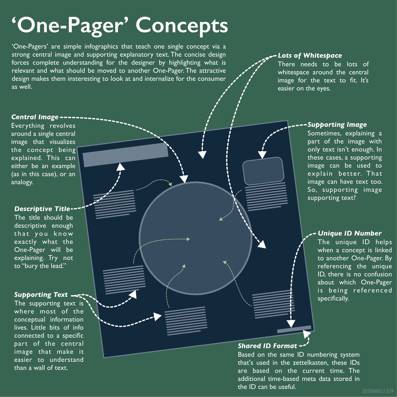
A one page design (or One Pager) is a graphical way of explaining concepts in a visual way. It is a visual representation of the way information is stored in the zettelkasten (Zettelkasten method of note taking), but rather than a focus on searchable text, it is meant to present that information to other people.
The benefit to the learner is it forces a full understanding of the topic because the end design is concise and clear.
The benefit to the consumer are that the information is presented in a "cool" attractive way, only one concept is presented at a time. And because the presentation is concise (Single idea zettels boost brain connections), only what's relevant makes it onto the page.
A side benefit is that the One Pagers are a consistent 11 x 11 inch size and follow a standardized design format so they can be compiled and printed into a coffee book.
The standard design format includes using a split complimentary color palette, clear visual heirarchy, and clear use of whitespace. In a practical sense, the main elements of a One Pager are:
- Title: A descriptive title that summarizes the
- Central Image: Made from a single example or analogy
- Supporting Text and Images: The purpose is to support and explain the central concept/image (Clockwork game philosophy builds infinite fun)
- Unique ID: The base ID and a revision ID if needed. A zetel ID (Unique IDs Make Notes Easy to Find) for the data it holds and the consistency across platforms.
- Whitespace around the image for visual clarity
A One Pager one pager can be found here (https://drive.google.com/file/d/1rsOnA0heKmF3_1abXCJIFSdBQKTEoNOX/view?usp=sharing).
Citations
#learning #onepager #toolong #ultralearning
4 Backlinks
Unique IDs Make Notes Easy to Find
In the zettelkasten method ([[201908211326 Zettelkasten method of note taking]]), each note is associated with a unique ID number. This ID is used as ...
About these notes
Howdy! I’m **Scott Sheppard**, and you’re inside my personal notes — a living, ever-changing collection of ideas. A lot of it is rough, half-baked, or...
Zettelkasten mimics brain connections
The process of collecting relevant notes for the [[201908211326 Zettelkasten method of note taking]] and processing them into permanent 'zettels' (not...
The David Perry Challenge
The David Perry Challenge is a structured exercise from David Perry designed for aspiring game designers to cultivate expertise and discipline. They a...